Primary lockupSVG ↓
SANDPIPER APPEAL / BRAND FIELD GUIDE / V1.0
Everything that makes Sandpiper Appeal feel like itself, from the first impression to the smallest detail.
Preview files are for evaluation. Commercial use and ownership are agreed with the acquisition.
01 / THE IDENTITY
An interlocking SA monogram pairs sculpted serif lettering with a single tidal line. The restrained wordmark and warm coastal palette create an identity for a considered lifestyle brand.
Keep at least one-quarter of the emblem’s width clear on all sides. Apply the same clear-space unit to the complete lockup.

Emblem: 32 px on screen or 10 mm in print. Full lockup: 180 px or 50 mm wide. Use the standalone mark when space is limited.
Use the supplied artwork. Do not stretch, rotate, apply effects, or rearrange the lockup. Choose a version that contrasts clearly with the background.
02 / THE PALETTE
RGB 34, 77, 80
RGB 244, 239, 229
RGB 203, 187, 158
RGB 204, 121, 94
RGB 169, 198, 190
Start with the foundation. Use Tidal and Shell for the majority of the layout. Add accent colors deliberately, not equally.
Readability comes first. Use dark primary text on pale backgrounds and white on the dark primary. Reserve mid-tone accents for large graphics. Check contrast whenever combining colors. Print colors should be converted using the printer’s requested profile.
03 / TYPOGRAPHY
Cormorant for expressive headlines, paired with Lato for clear body text.
HEADLINE / CORMORANT
Aa Bb Cc
By the water.
ABCDEFGHIJKLMNOPQRSTUVWXYZ
abcdefghijklmnopqrstuvwxyz
0123456789
BODY / LATO REGULAR
A little closer to the coast.
Suggested web scale: 64–96 px hero, 40–64 px section title, 24 px subhead, 16–18 px body, and 11–13 px labels. Use 1.5–1.65 line height for body text and generous space between sections.
Fonts are included under their respective open font licenses. Logo lettering is outlined and requires no fonts to display.
04 / POSITIONING & VOICE
A coastal lifestyle brand for considered homewares, thoughtful gifts, and small everyday escapes.
Audience: Design-minded coastal shoppers, home enthusiasts, gift buyers, and boutique guests.
Proposed direction for the buyer; no active operation or business capability is represented.
Let the details do the talking. Use tactile, specific language. Keep the coast present without leaning on nautical clichés or unsupported sustainability claims.
Thoughtful things. A little sea air.
Use honest specifics. Avoid fabricated testimonials, unverified credentials, and promises the future business cannot support.
A little closer to the coast.
05 / BRAND IN USE
Original editable assets for digital profiles, social posts, and print concepts. Built to carry one consistent identity.
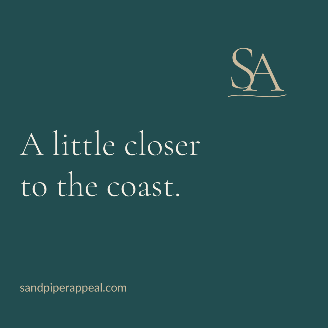
Social square / 1080 × 1080SVG ↓

Profile avatar / 512 × 512SVG ↓
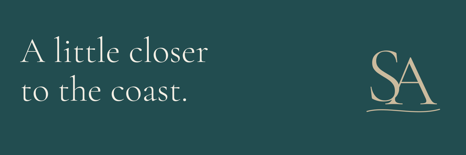
Social banner / 1500 × 500SVG ↓
Business-card front / 3.5 × 2 inSVG ↓
Repeat pattern / editable SVGSVG ↓
These are digital concept files. Add personal details and printer-specified bleed before production. Printed goods are not included.
06 / THE FILES
Explore the artwork, then talk to Aetheric Holdings about acquiring the complete domain and brand package.
Download the preview kit ↓